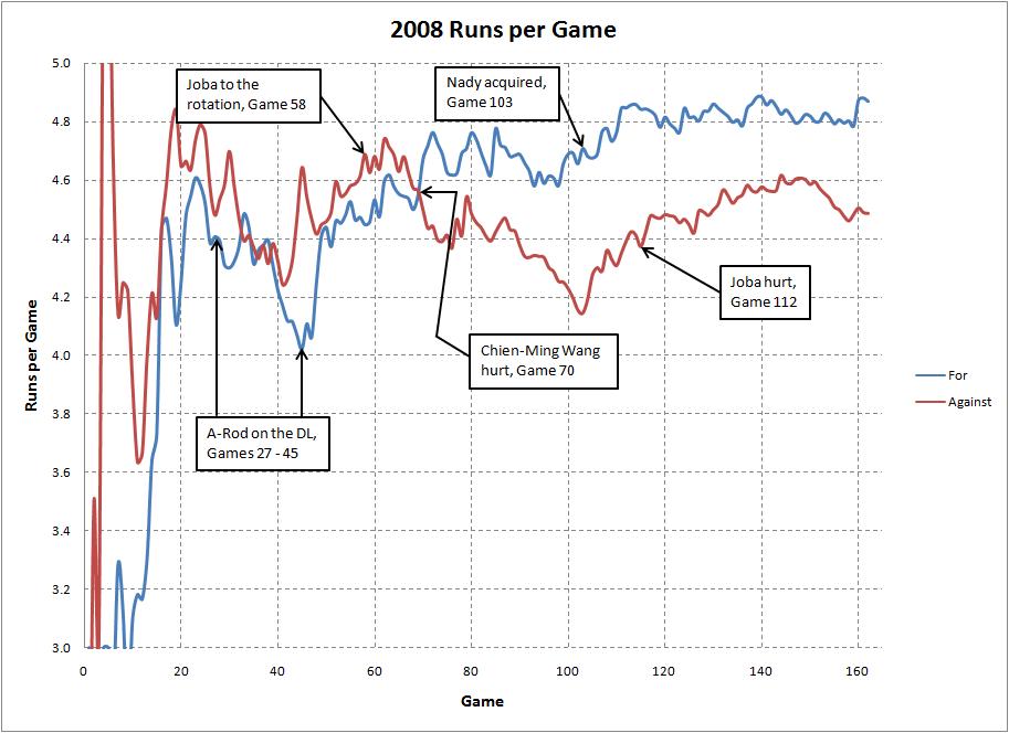
 (click image for a larger view)
At BlueSeat Blogs the other day I posted a graph showing the Rangers’ goals for and goals against during the course of the season, which explained why they weren’t able maintain their hot start (their defense came back down to Earth). I thought it would be interesting to see how the Yanks’ season last year shaped up in terms of runs scored and allowed, so click on the above graph and take a closer look. There’s some interesting stuff in there.
The blue is runs the Yanks scored, red the runs they allowed. Note how the offense suffered when A-Rod was on the DL, and how the run prevention improved when Joba was in the rotation. Otherwise here’s your open thread, so talk about the graph or anything else you want. Just don’t be mean.
Leave a Reply
You must be logged in to post a comment.