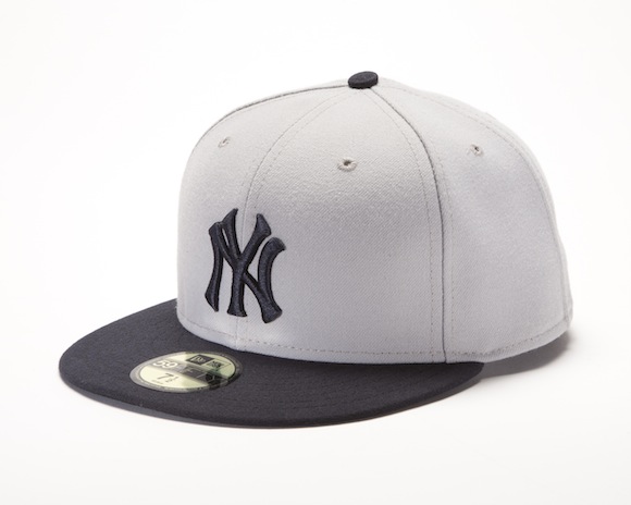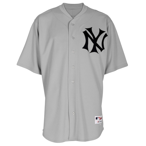
While watching the Twins and Yankees play on Wednesday night, I took stock of the field and shook my head at the Twins’ uniforms. Minnesota sometimes sports these alternate road jerseys with grey pants, and the team looked as though they were more prepared for a Spring Training game than a regular season affair.
The Twins though aren’t the only team with solid color tops. All across baseball, either as part of a marketing effort or to vary up the styles, clubs have added alternate uniforms. The Angels were sporting solid red tops over the weekend; the Blue Jays wear something that’s, well, very blue; and the Red Sox too have solid red or blue tops for home or away games, respectively. Call me old fashioned — or a Yankee fan — but I much prefer the solid look.
The Yankees, meanwhile, have not broken with tradition. Except for one game during which MLB honored the Negro Leagues, the Bombers have steadfastly refused to discard their now-famous home pinstripes or road greys. The uniform may have looked a little different in the earlier decades of the 20th Century but for over 50 years, since the Yanks ditched the alternate road jersey in 1943, the club has adhered to tradition through thick, thin and whatever MLB marketing gimmick crossed its path.
That is, they’ve adhered to this tradition until today. When the Yankees and Red Sox take the field in a few hours at Fenway Park, they will be dressed in modern garb updated to resemble the 1912 team. It’s Throwback Day for the Yanks for the first time in franchise history. It’s finally okay to tinker with obdurate tradition as long as the club is honoring that tradition, and I like it.
For the game today, the Yanks will sport the cap atop this post. It’s an updated look on the 1912 original. This one, from New Era, is a bit different from the 1910-1911 Cooperstown Cap. The interlocking NY is the modern version and not the compressed version from the past. The colors though — a grey cap with a navy blue bill — are sleek.

The jersey, above, are similar yet different. Gone is the New York in block letters across the front, and the interlocking logo looks a bit more historic. The serifs on the letters are more pronounced and wider, and there will be no names or numbers on the back. It’s a look straight of the time when the AL ball club had yet to settle on an identity. They weren’t quite the Highlanders as many believe today, but they weren’t yet fully embraced as the Yankees yet. (The club will also be sporting appropriate stir-ups with the high-sock look.)
I enjoy this nod toward tradition. It’s not garish; it’s not ruining the Yankee brand or the Yankee legacy. It’s a glimpse of history in 2012. And at least the Yankees of 1912 had that identifiable logo and branding. The Red Sox throwback hat is, on the other hand, such a hilarious beauty that you’ll just have to see it for yourself.
Leave a Reply
You must be logged in to post a comment.